Typography as a tool to create book identity
I would like to consider the identity of the first book series of the publishing house “Strelka Press”, developed in 2012 by the design studio “OK-RM”.
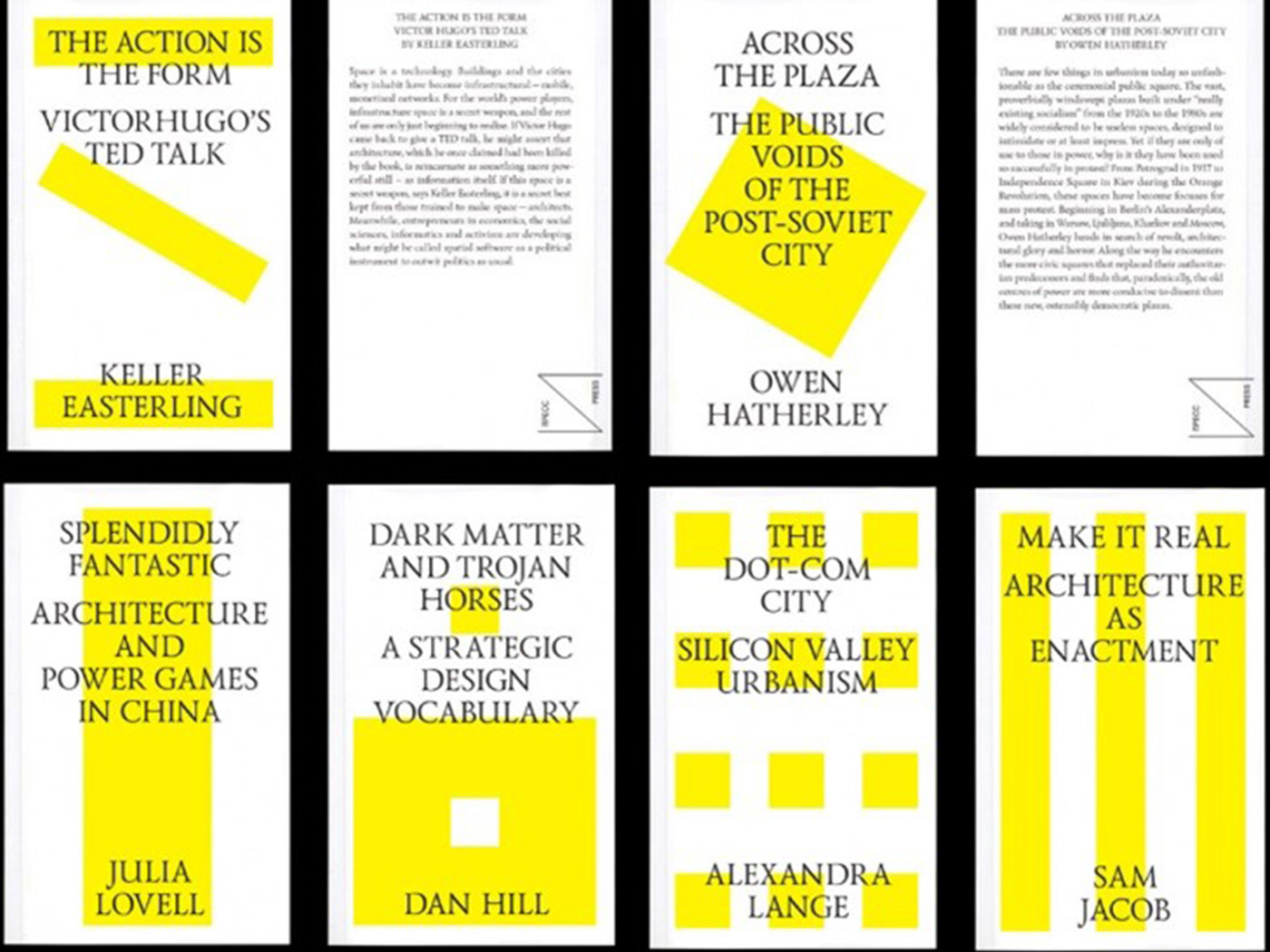
First, a little bit about the task set for designers: the publishing house “Strelka Press” specializes in publishing books on modern problems of architecture, design and urban development in English and Russian. In addition to paper editions, Strelka Press at that time offered a new genre format — small e-books. Digital e-books, which the publishing house does not produce today, have become one of the main technical limitations for designers: the design of the first series of books should not only look bright on the shelf, but also be quite simple and easily adaptable to different digital platforms. From the point of view of design, the series had to be bright, provocative, surprising, and at the same time it had to maintain consistency and recognizability. In addition, it was necessary to take into account the Russian context, alien to foreigners.
OK-RM designers Oliver Knight and Rory McGrath approached the design of the first series of seven covers from the position of modernism, which determines the secondary form in relation to functionality, so the series of book covers turned out to be exceptionally functional, without any unnecessary, unnecessary and ill-conceived details.
Typography has become a key design element that determines the way content is conveyed. And here an important role is played by the typeface of the main font of the covers — the Lazurski typeface, created by Vadim Lazursky, one of the greatest typographers and graphic designers of the twentieth century. Why was this particular headset chosen? Rory McGrath says: "… this font was often used for art books in Soviet times, so there is a strong historical connection between the past and the present. In addition, it looks beautiful, especially in comparison with a clear modernist font."
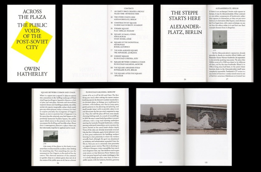
There is nothing superfluous on all seven covers that could distract the reader from the essence — this is due to the placement in the digital space in which the existence of electronic books was assumed and the accompanying acute need to formulate the essence of the book in one simple image. The title of the book and the author are typed in one large size. A single font size establishes the equivalence of the information being compared. The font color is always black, the label is centered, the set is uppercase. The title of the book is “tied” to the upper edge of the cover, the author’s name is attached to the lower part. Typography is the “top layer” on the cover, the bottom layer is a kind of free play with simple geometric shapes of bright yellow on a white background, in which the reader can guess various architectural structures, depending on what the book is dedicated to. The combination of a white background, calm “classic” black typography and bright, almost luminescent yellow geometric shapes floating freely in the space allotted to them creates maximum contrast in the perception of this series. “Simple forms are also extremely important to us, although they are often very typographic in themselves — in the case of the Arrow, they mostly work as signs. Signs are the primary language that we all understand,” says Rory McGrath.
The spine and the back cover are also always decorated uniformly. The “Strelka” logo is located on the spine at the bottom, then the name and author are also strictly capitalized, in black on a white background. The back cover is built on a similar principle: the Strelka press logo is located in the lower right corner, a brief abstract, title and author are in the upper left corner.
The principle of the cover design gets a logical development in the design of the indoor unit. The first thing you pay attention to is how harmoniously the modernist layout principle intertwines with the classical one: layout on a modular grid, but at the same time a two–sided layout; free arrangement of photos on a grid, but at the same time rigidly centered columns and centered chapter titles typed in capital letters. A pleasant rhythmic series that develops in space when turning pages does not cause a sense of monotony: text blocks are interrupted by spreads with photo images, new chapters are beaten off with simple laconic titles that repeat the principle of the cover layout, delicately embedded in the text blocks of free-standing photos. The whole series is imbued with incredible consistency and consistency, but it looks very fresh and lively, one can only wonder how with such a minimalistic set of tools, designers managed to create something unique and so individual, with a strong graphic side and a harmonious structure.
“I prefer to think that we are constantly moving forward, although it is not always easy… The role of the book is to look interesting. At first we approached the design of this series very conceptually, but then we realized that the cover should simply not be beautiful and new, but memorable, reflect the modern arrangement of the old — and mean exactly that,” says Rory McGrath.