In search of the best Poster ever
It turned out to be a very difficult task for me to write about the best poster from my point of view. It seems to me that there are a large number of posters worthy of being called “the best”. There are many serious social posters that make the heart shrink so much and a lump rises in the throat that it is incredibly difficult to write about such posters, but they definitely occupy one of the “best” places in my personal rating. I would like to write about a series of posters by Vladimir Chaika and a poster by the South Korean designer Byoung Il Sun, which are easy for me to write about, because they cause me great warmth, although they are probably difficult to classify as “the best”.
A series of posters by a Russian designer.
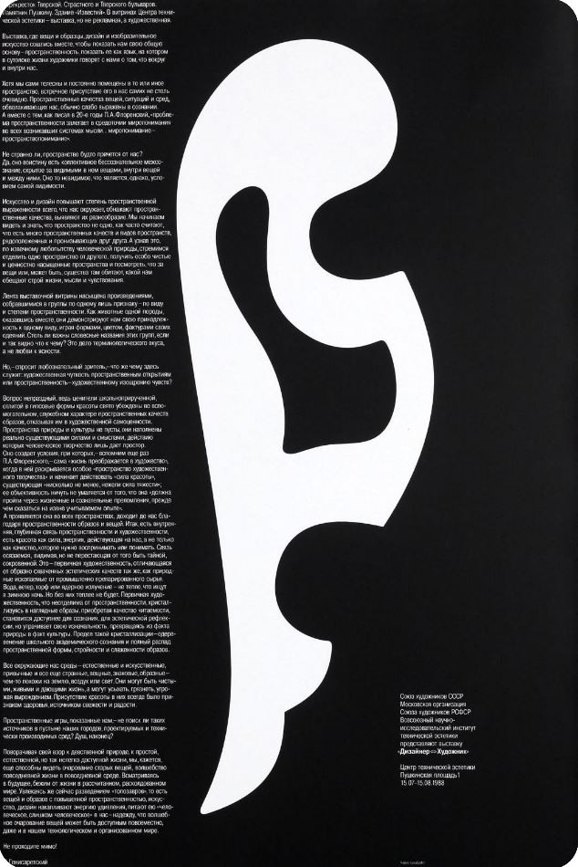
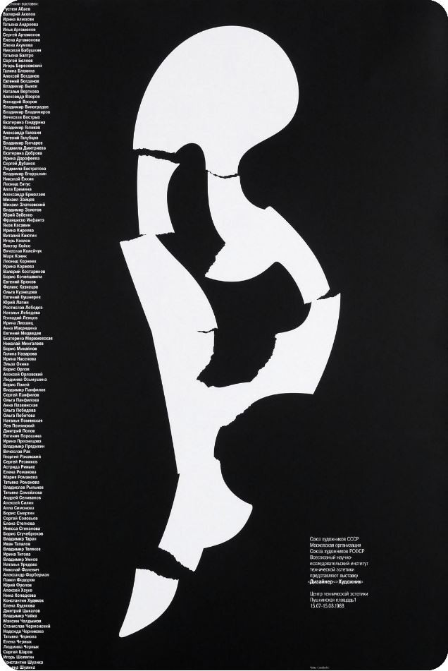
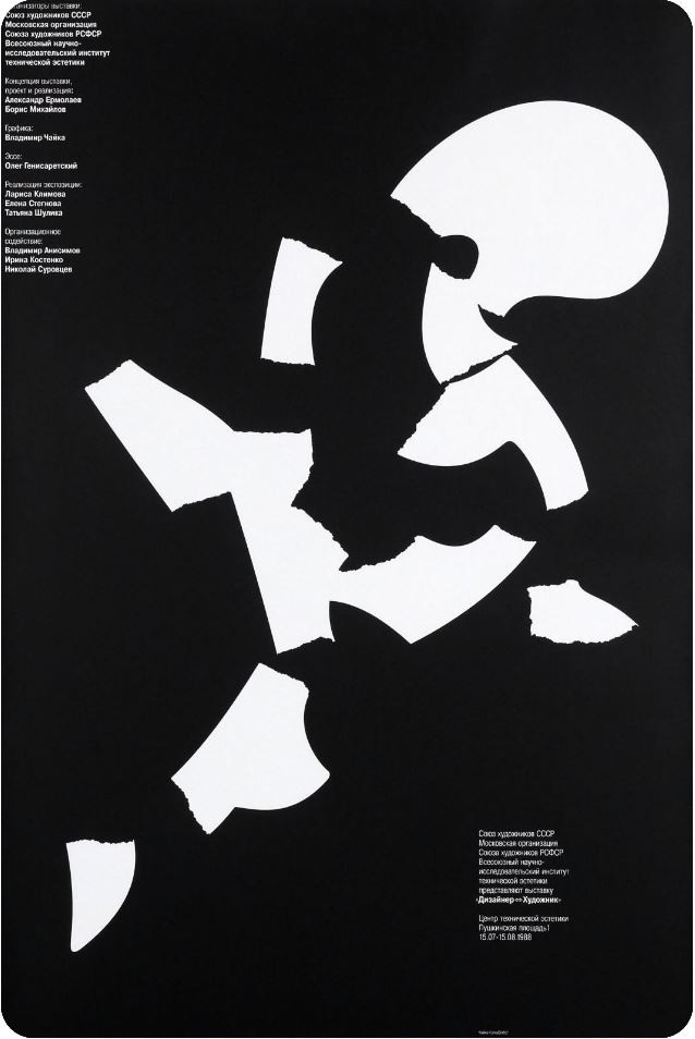
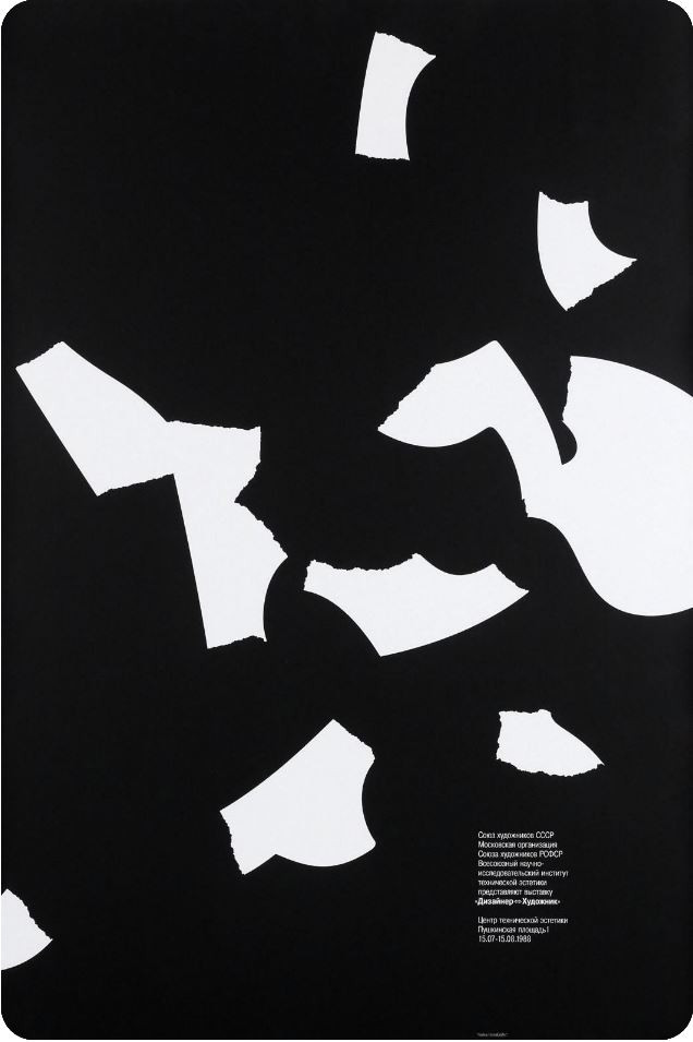
A series of posters by Vladimir Chaika, created in 1988, for the exhibition “Designer <> Artist”, which was held at the Center for Technical Aesthetics in Moscow. The series of posters consists of four sheets, on a card in the Russian State Library these sheets are called: “Essay on art and design” (sheet No. 1), “List of participants of the exhibition” (sheet No. 2), “Information about responsibility” (sheet No. 3), “Image of fragments of patterns” (sheet No. 4).
It is necessary to say a little about the context of the 80s — the time of the creation of the series, S.I. Serov wrote about this very accurately in his book “Style in Graphic Design” (VNIITE, 1991): "… the splashes of the “new wave” reached our shores, and here, to the surprise of everyone, style solutions were found, not only not fitting into any theoretical and methodological framework, but also directly overturning barely established ideas. On the territory of visual and communicative design, unidentified stylistic phenomena that could be called alternative suddenly appeared."
The series of posters surprisingly accurately reflects two parallels at the same time: the context of the ongoing changes within the language of graphic design and the main theme of the exhibition — the study of spatiality as a language spoken by artists with their audience. The first sheet in the series is made within the framework of the classical modernist paradigm — a single integral symbolic form exists statically in the surrounding space. It is read as quickly as possible due to the contrast of black and white. Text, form and free space are equivalent members of the composition, coexisting side by side, but not interacting with each other. But then, on the following pages, the space gradually becomes more active and becomes the main actor. The amount of text decreases, yielding leadership to the image. The shape of the pattern breaks, the structure of the composition tends towards chaos, the consistent destruction of meaning, increasing in each subsequent poster, unfolds to the viewer both a picture of the change of graphic paradigms, and opens up a new essence of the surrounding space.
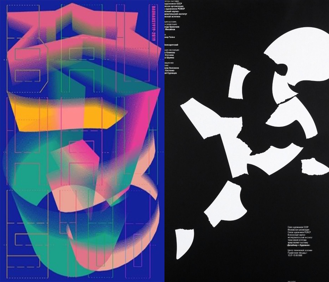
Poster of a Korean designer.
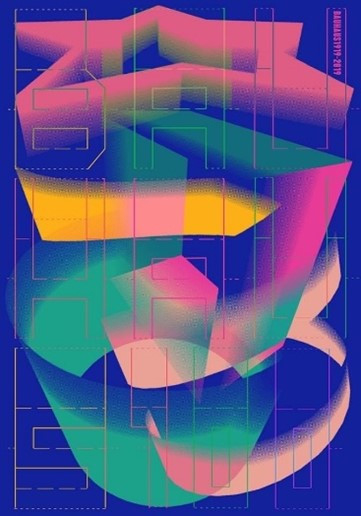
The poster by the South Korean designer Byoung Il Sun is dedicated to the centenary of the main art school of the twentieth century — the Bauhaus. The poster is multi-layered and complex-structural, in which each layer reveals a new meaning and a new statement about the school. The first basic background of the poster overlaps the second layer of a three-dimensional structure consisting of simple geometric shapes. The linear-typographic upper layer forms a grid of thin colored lines — the inscription “Bauhaus 100”. Linear letters and numbers are based on a simple geometric module that sets the same thickness and rhythm to all strokes. The light linear forms resemble the clear divisions of the architectural facade of the Bauhaus building in Dessau, and the contrast with the second layer of the image is consonant with the contrast of enclosed spaces with transparent open workshops. In addition to the information message, the upper layer has a special function — it is a construction that turns a flat sheet of a poster into a three–dimensional thing and implements one of the principles of design at school — it makes it possible to feel the joy of creating a new object. The two upper layers of the poster image are logical in their contrast: the transition from a point to a line, from a line to a plane and then from a plane to a volume became the basis for the shaping of the Bauhaus. The volumetric construction of the second layer refers to the famous propaedeutic course and its author’s pedagogy. Here you can see the basic forms of Itten; and the primary elements and their derivatives of Kandinsky; and the structural and spatial constructions of Laszlo Moholy-Nagy. The poster author does not directly use the main colors characteristic of the forkourse: red, blue and yellow, but will replace them with less contrasting colors: pink, blue and dark yellow, and also adds a gradient color stretching technique that connects the three-dimensional shape with the background. The spiral–shaped structure is completed by a star — a figure uncharacteristic for the exercises of the forkourse, but symbolizing the stellar history of the school and the stellar teaching staff.