Maxim Spivakov. Modern artist and book designer.
I want to write about a young artist and book graphic artist Maxim Spivakov, and it“s not that I consider him the best book designer, no, that would be too “strong” a statement — it”s impossible to choose one best book designer, but I’m interested in his work as a representative of the younger generation that comes to book design — with new views, own statements, etc.
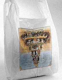
Maxim Spivakov was born on May 28, 1984 in Moscow, lives here and now. He studied graphic arts at the Moscow State University of Printing; graduated from the Faculty of Philosophy of the Russian State University for the Humanities; at the beginning of his career he worked with the design bureau “Pike”. First of all, Maxim is known more as a modern artist. Here’s what Afisha writes about him: “Spivakov is from a generation of young and witty postconceptualists who do not get tired of picking fights with the world of capital, censorship and institutions and whose well—aimed, though not too painful attacks are always interesting to watch. Maxim makes simple, sometimes quite elementary, but always caustic anti—capitalist jokes — like the circulation of plastic bags with an upside-down image of the class pyramid of capitalist society.”
The most famous was Spivakov’s project “Maxim Spivakov. ½”, created specifically for the Vadim Sidur Museum, dedicated to the problem of the image, the practices of its denial, the politics of visibility and contradictions revealed in the history and modern manifestations of iconoclasm.
As a graphic artist, Maxim designs books and protest propaganda products, collaborating with the publishing houses MMOMA, Garage, AdMarginem — a publishing house specializing in the publication of foreign non–fiction texts on topical issues of contemporary art and cultural theory (Susan Sontag, Walter Benjamin, Andy Warhol, Tom McCarthy, John Berger, Hans Ulrich Obrist and etc.).
The books designed by him are distinguished by minimalism with a special thoughtfulness of structure and dialogue with Swiss design. Here, for example, is the catalog of the 1st Ural Industrial Biennale of Contemporary Art, which combined 59 works by 54 artists and art collectives into a detailed curatorial story unfolding around several themes: “Drummers”, “Circulation of Images”, “Building Capitalism”, “Economy of Free Time” and “Reading Room”. The catalog is conceived in the form of a book, a continuous story, and not the usual “one artist — one spread” system.
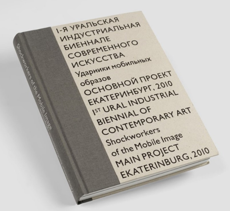
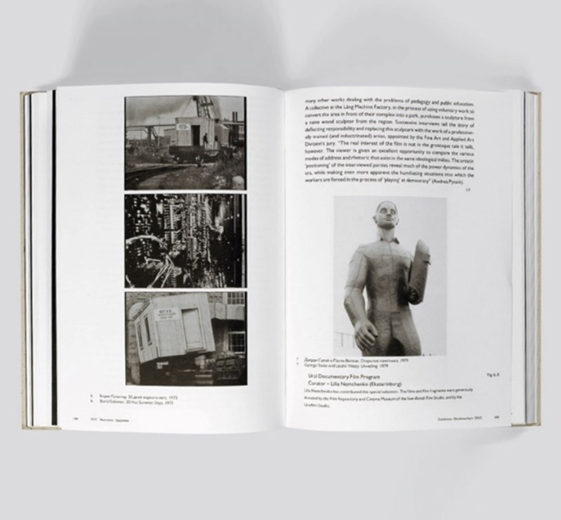
The cover is covered with two contrasting materials — dark gray and light beige, the entire front part is occupied by a typographic composition — the name of the catalog in Russian and English. The technique of comparing the two languages develops throughout the book: the left turn bars are Russian–language information, the right turn bars are English-language. All illustrations in the book are black and white, except for color photos of collages made by anonymous employees of the Ural Worker printing house, where the exhibition was held. All works at the exhibition are accompanied in the catalog with information about the method of their production and transfer to Yekaterinburg. Rather narrow margins, a single-column set with the left-hand switch of a large pin in the theoretical block, which fights off the main information with black spot turns, sharply contrasts with the layout of the catalog part. There we see wide margins, a central switch, the size of the pin reduced by half, a centered arrangement of photos and small section titles typed in capital letters, delicately located in the upper left corner of the strip.
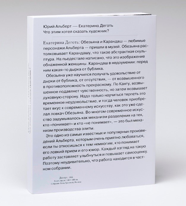
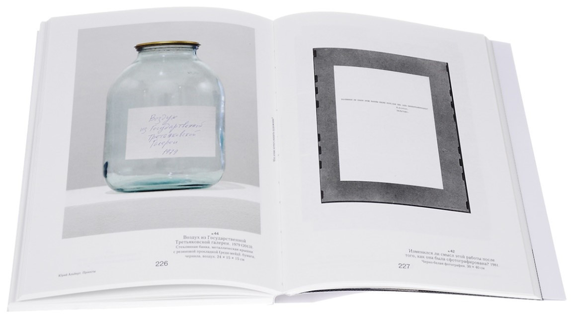
Another book by Maxim Spivakov, which received the 2016 Zhar-Book award, is called “What did the artist want to say with this?” — the result of the joint work of Yuri Albert with curator Ekaterina Degot. Yuri Albert, one of the outstanding representatives of Moscow conceptualism, lives between Moscow and Cologne. In his works, he explores the relationship between a work and its interpretation, the production of art and its consumption, between the visible and the invisible in art.
The book includes Albert“s works from the 1970s to the present: paintings, photographs, objects from public and private collections, as well as from the collection of the author himself. The need for such a large-scale publication dedicated to Albet”s work has existed for a long time and was dictated by the need to fill in the gaps in information about the author’s artistic practice. The book is unique in that, in addition to the pictorial series, it has voluminous theoretical material explaining and describing literally all the works presented in the book. Ekaterina Degot, a critic and curator, was named as a co-author of the retrospective exhibition of the famous conceptualist. Such an exotic solution contains an indication of one of the most complicated production problems of modern art — the disposition “artist-curator vs curator-artist”.
As a result, the final exhibition catalog can be perceived as a kind of “promotional object” (Andrey Monastyrsky“s term), which completes the performance exhibition. It is this fact that determines the unusual design solution of the cover — on the front side of the cover there is a rather extensive text Tar, and the painting by the artist Albert — on the back, although usually exactly the opposite happens. Inside, the catalog is designed in a strict style, again with an appeal to the Swiss layout. The illustrations are highlighted in a separate block, the navigation is very logical. There is no biography and bibliography in the book, but Albert”s own texts are collected in a special section. The neutrality and transparency of the layout does not score, but on the contrary emphasizes the artist“s work, the dialogue of the classical and modernist paradigms does not enter into an active conflict, but on the contrary, emphasizes the extravagance of the artistic material. The descriptive texts of the invited authors, which turned into an ambivalent decoration in the exhibition, acquired their original function — to explain and interpret the artist”s work. But in this calmness and “correctness”, the question remains suspended in the air: “What did the artist mean by this?”, to which the catalog does not give an answer, since it is more important to ask the question correctly than to get an answer.