Proof of absence: my thoughts on mockups as simulacra
- 1. Presentation Fetishism
- 2. The Ontology of the Mockup: The Mockup is the Message
- 3. Trust, Credibility, and Surrounding Realness
- 4. Mockups as Post-Production Simulacra
- 5. Outro: Illustration
1. Presentation Fetishism
To exist is to be shown. Being a design student who by proxy is trying to have a certain online in-the-know design presence, it sometimes feels like the projects that I didn’t post on Instagram do not even exist. They do, of course. In my graphic design university building drawer, in my OSIRIS grading and in my iCloud. But if I, as a curator of my own design universe and a vision of myself, do not deem a project “presentable”, I will simply make it not exist. If I don’t post it on my Instagram or my portfolio, I will also forget about it. It is not going to be a part of my design identity, and it is not going to be a part of me. The designer that I am is the designer I present myself to be. The design I make is only the design I present. That is the design I send to open calls, the design that pops up when you google my name, the design I will show to non-designers when they ask about what I do. It goes without saying that my design only exists online. That is exactly the reason why I have the power to make it exist or not exist, because in the online space I am the creative director of myself.
This is where presentation fetishism begins. In my previous university, whenever we had a project that would take three months to complete, I would have to spend one of those months working on the presentation alone. I am not talking about a physical installation, not a singular event of confrontation with the design, but instead I am talking about a pdf, a presentation in a corporate sense. We never actually produced anything physically. All the cool students number their pdf pages, somewhere unorthodox, somewhere unexpected, either too small or too big, and put “Y1S1” on every slide, standing for year 1 semester 1. The cool students have small margins on their slides, and use popular fonts in a tiny size. The good students will design their pdfs in the same way they design their projects, using the same grid and font as their project does, the teachers love that. The bad students use novelty display fonts for their title page instead of Arial or Times New Roman and probably a black background (trying to seem like the cool students). None of the students use templates, since even the bad ones know better.
The cool students will not use Photoshop mockups, where you put your image into a mask layer and it will place it on a cardboard box with a texture overlay. They will use a photo they found on are.na that looks as if it was someone’s unedited piece of non-photography from their camera roll, and they will use Multiply layer mode to put their design on top of that. A little blur to match the low quality. The design looks more Real that way, as if another cool person is using it in real life.
In the rare case when we actually produce something physical, it will be a book (that will be binded by a local printing house worker working overnight to make all our projects happen before end terms, nothing is ever physically made by us). The bad students will later go to a photo studio and take pictures of it, with good lighting and white background. The cool students will flatbed scan it. The background would be black. Maybe a hand that’s holding the book down will show faintly. They will not edit it. They will say: “Here, this book exists. I scanned it.” By that they will mean: “This book is simply scanned, therefore it is Real. It is not a mockup.” The curious thing is that the designs of the book assignment itself are not really as different as their presentation methods are.
Design is a performance act, and you spend a big chunk of your time designing a proof that your design exists in a specific way. This demonstration over practice was the agenda of my university. The bad students eventually learned to use small margins and Times New Roman and use these pure aesthetic signifiers, this edgy anti-originality of default systems design, comically descriptive and exaggerated to be indistinguishable from actual default design except by the wealthy in-the-know.
I am following the fashion of the second part of the XX century where with Jean Baudrilliard’s Simulation and Simulacrum becoming popular, culturologists decided to analyze every part of creative practice — fashion, design, art, moviemaking, internet resources — as simulacrum. I haven’t seen much thought be given to mockups in the same realm. I’m assuming that’s partially because of mockup dynamics becoming more complex only in recent years.
2. The Ontology of the Mockup: The Mockup is the Message
A mockup is neither design nor a product. It is “designed”, and is a “graphic”, because the intention of creating a visual is there. But the whole purpose of it is that the “design” is lacking in the mockup. In a way, but what about shell designs? Some mockups have placeholder graphics that serve as marketing, and describe its properties. Showing what a trendy pinterest-y shell design might look like placed on it. These are not real “designs”, but already simulations of what we imagine a “piece of design” to be, simulations of “design-ness”. However, a mockup is also not necessarily a product. There is no finality to it. It is presented to us as a tool, by designers and for designers. The mockup itself will never be the end product. It has no space, no time, no author. No photographer. The only thing that is undeniably there is our trust that the object exists, whether it’s a MacBook render floating in grey nothing, or a poster hung on a brick wall somewhere European-looking.
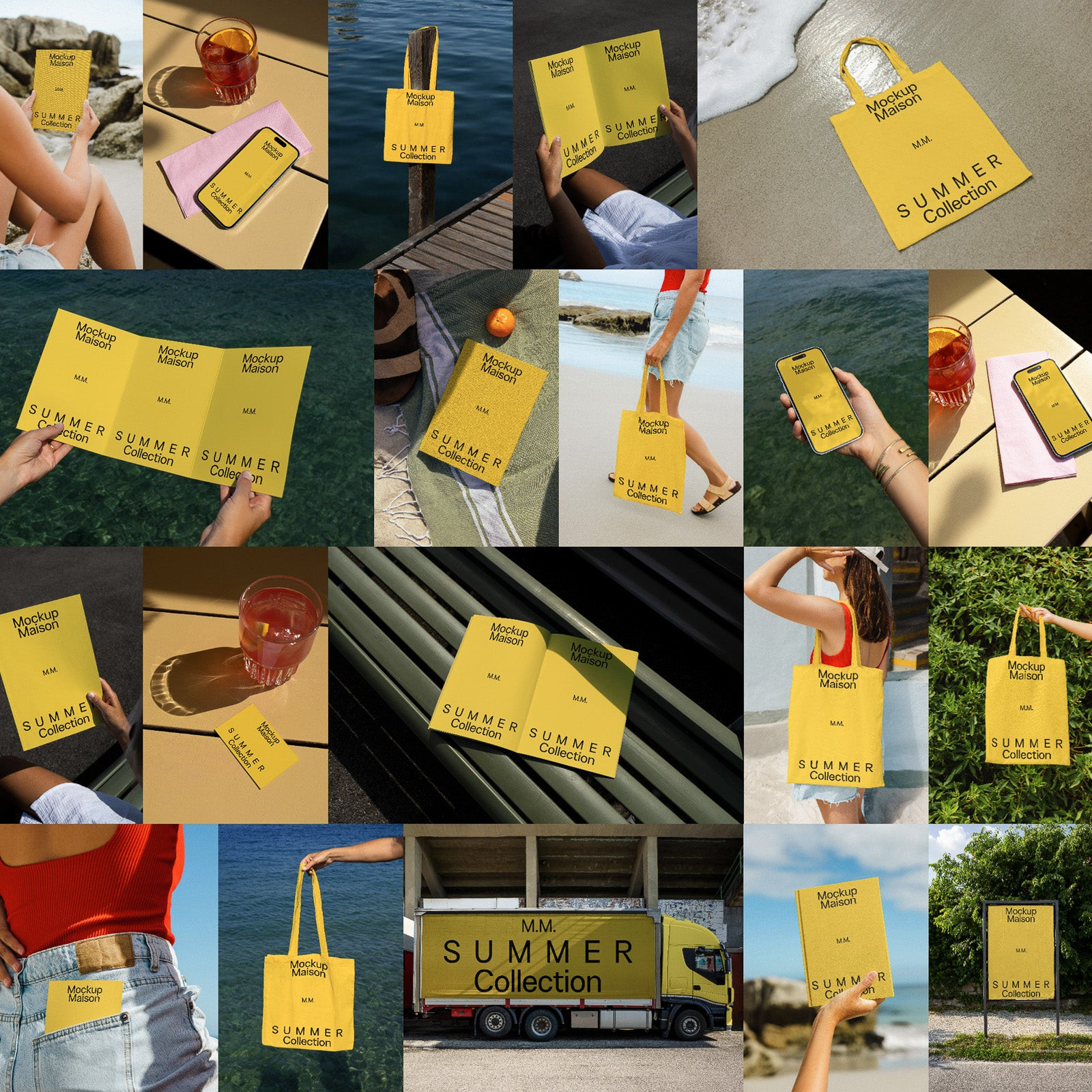
The placeholder designs almost seem to exist in the same realm as Canva presets, except they are not made to be re-designed, but replaced. Canva preset is a simulation of design. Mockup placeholder is a simulation of “design-ness”. When I look at these placeholders (ones for trendy mockups, which are the only relevant ones to me), they are almost always these undeniable “good”, non-offensive designs, very simple modernist all-caps, sans serif typographic compositions. This is the same aesthetic signaling as I saw in my university, except the audience is broader now. It tells you: “I am a product that your trendy design will look good on top of. I get it. I am unlike these bad looking rendered cardboard boxes made to put a bad logo on, I am instead made with good design in mind.” I will much rather use a t-shirt picture I found from an A.P.C. or Acne Studios campaign, never one from a Zara webshop. And if I want to use a mockup, as in a digital twin, I want to use one that signals status and insider knowledge of taste. Here, instead of a mockup being used to sell a piece of design, the design is used to sell the mockup.
To come back to the Ontology part of this title, I think of mockups as something in between absence and presence. In OOO (Object-Oriented Ontology), a mockup would be a hyperobject: something we interact with, but never fully grasp. It always leaves something out, one way or the other. Does a mockup then produce a new object when it is being filled?
3. Trust, Credibility, and Surrounding Realness
4. Mockups as Post-Production Simulacra
To apply this logic to graphic design, I look at the difference between old-school concepts such as original, copy, and imitation, and the post-production world of nowadays as outlined by Andrew Blauvelt in "Tool (Or, Postproduction for the Graphic Designer)".
I want to come back to my university’s intricate system of status signifiers. We all remember how it used to be popular to call yourself a "multidisciplinary designer". That is, until "interdisciplinary" came along and replaced the word in everyone’s Instagram bios. An interdisciplinary studio makes more cutting edge designs, has cooler, niche-r clients and audience. After some time spent around even cooler students, practicing designers, after more conversations held with cooler tutors, after more open lectures and gallery openings visited, you become a "transdisciplinary" designer. I wonder if the next graduating year will call themselves convergent, or it’ll be more subversive and meta to start calling yourself just disciplinary. "We are a single-disciplinary studio with no awards," I said in a Telegram post of the design practice we founded with some friends from that university, clearly already ahead of the curve.
I think this really is a symptom of the endless self-referencing and reconstructing that asks of us for fast paced rotation of design projects, as well as the large scope of possibilities. This new torrent of design is perpetuated by the self-perpetuating archive of millennial portfolio culture. Tumblrs, "My work" are.na channels, and most importantly, Instagram feeds. Your design is now contextualized not only by hundreds of years of design history before it, but years of Instagram-d and Tumblr-d designs, as well as your own feed and your general online presence as a designer.
A mockup is a visualization of design use, not its use. As Raf Rennie said on X, “how many people have designed an actual billboard vs. the amount of billboard mockups there are?” I’ve used mockups for CD players, Orthodox Christian attire, chess boards, wax plates, and architectural store fronts. Obviously, none of these things have ever been produced, used, or even seen beyond the image. They are detached from context, function, and use-value. Instead, they participate in what Baudrillard would call a “third order” of simulation — no longer representations of reality, but pure signs that refer only to other signs: surface of design responding to surface of someone else’s photography. If a project only exists as a well-made mockup on Instagram, and is never printed, used, held, or even opened — did it exist at all? In a design school, the answer is yes. In a design school, the quality of the mockup is often read as the quality of the work. Mockups do not represent the work, in some way, they are the work. Like concept cars at an auto show, they are not meant to be driven, only admired for the values they suggest. Just as in fashion, the runway look may never be worn, but the photo of it enters circulation, becomes a reference, a meme, a proof of participation in culture. So too with graphic design: the documentation, not the design, is what circulates. It is the documentation that accrues cultural capital. I’ve only held Metahaven’s €500 Uncorporate Reality book for the first time last week, after reblogging the scan of it 5 years ago on Tumblr.
How does that shift the value of authorship? Mockups present the designer rather than their work. It’s a tool of self-fashioning, a medium not for the design but for the designer’s own myth-making. Here’s where eidos comes into play. A good design idea is the most understandable way to convey the eidos of a thing or phenomenon. To convey the eidos of a thing, it is necessary not only to reproduce the image, but also to embed similarity, internal similarity with the original (aka the form of an entity). "In a virtual environment, signs reach their ultimate state — to simulate meaning, to simulate the absence of meaning, to simulate the absence of simulation. The further evolution of the habitat will be associated with the search for a new meaning of objects. The reality of things will be returned to the world, but these will be objects that have passed through the cultural filter. An object ennobled by culture is a found idea, the eidos of a thing. Finding the idea of a thing is a practical task of design and its philosophical essence." In this sense, a mockup is a biographical surface, not just a representational one. A mockup like a selfie — curated, optimized, and uploaded for public verification of existence. A mockup acts like a tool, but really it’s a performance product.
5. Outro: Illustration
Stage One:
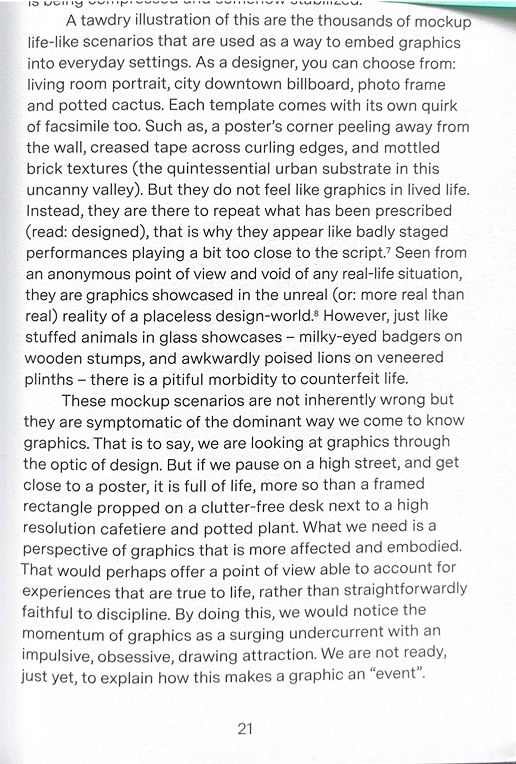
Initially, the sign (image or representation) is a reflection of basic reality. Here, I scan empty pages of printed matter about design (mostly design theory, research or criticism, mostly Dutch). In some cases, I photoshop the text out of it to create a mockup (making this unreal already, but the connection with Stage One here is mostly just conceptual). The book is being scanned — scanning being the most honest confirmation that a designed object exists. Just as it is the most accessible way to photograph printed design, since it doesn’t require:
(01) a space
(02) lighting
(03) photographer
(04) physical setting
All that plus having the stylistic quality of “imperfection” or pretend-amateur, casual aesthetics.
Here all I have is the book, an empty sheet only action of which is to exist.
Stage Two:
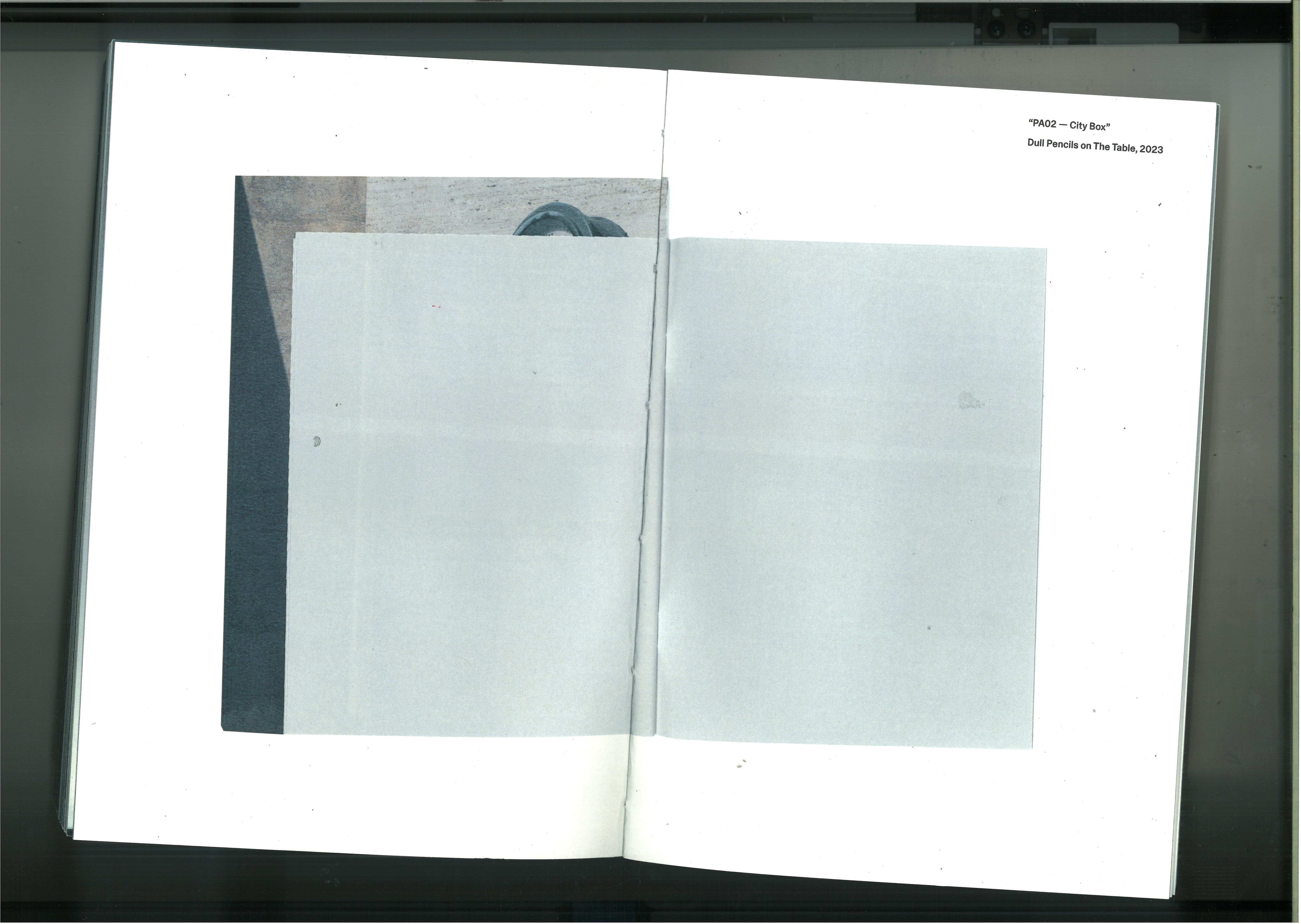
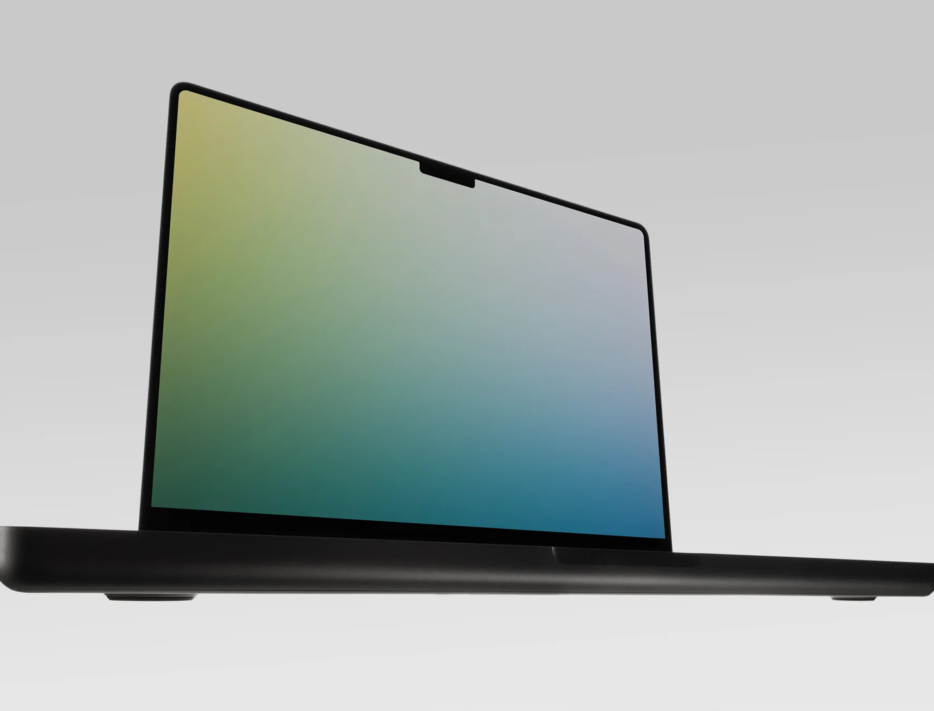
The sign makes a basic reality. The image becomes a distortion of reality. Here, someone (in this case, Directory Mockups) created a fake reality, representing something real. A universe of laptops floating in grey space, or anonymous hands holding a book, just like the ones I scanned earlier. A corporate tool that exists in a liminal space. The gradients replacing the imagined design is what I consider to be distortion here. This is still real, the majority of these images being professional photographs, or perfectly real renders.
The mockup tells me, “Look, I exist, ” however the situation is fabricated at its core.
Stage Three:
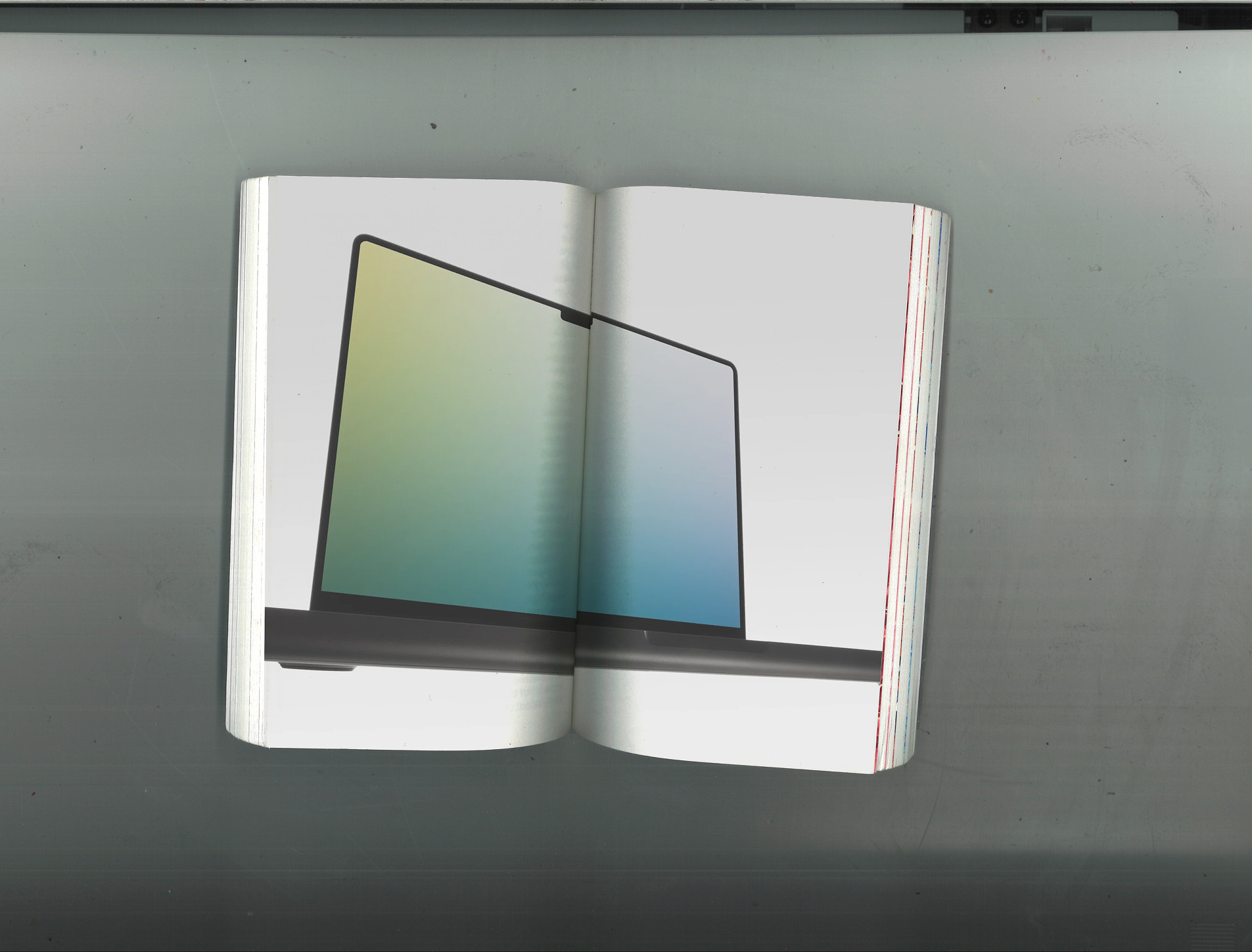
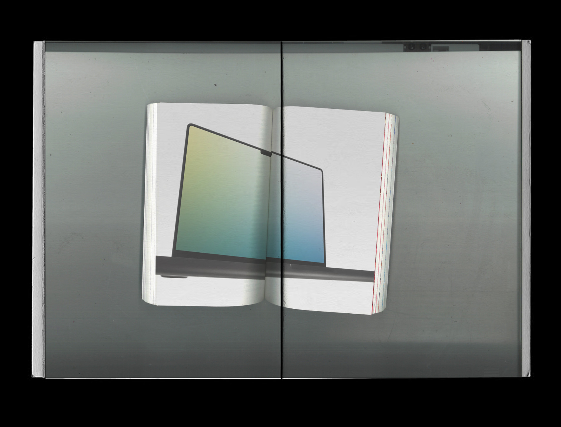
The sign marks the absence of basic reality. The image calls into question what reality is and if it even exists. Here, I put these fake realities of floating laptops into the most Real (in this case, scanned). A fake Real inside a real Real. This is a realistic printed image that was never really printed, it was never designed, and never had a purpose. It exists to prove its own existence. Just like in Jean’s theory of the Stage Three, this is an image of nostalgia for something that no longer exists. I’m documenting and presenting these fake Real artifacts, they don’t exist on their own anymore.
This is hyperreality.
Stage Four:
The sign bears no relation to any reality whatsoever; it is its own pure simulacrum. Here, I’m treating design as this self-referential theater. I go through the process of designing and printing something that lost any connection to the original book scans, nor the Directory Mockups. An abstract visual that only references the idea of presentation. No design, no object, no illusion, here I’m formatting the structure of belief. It’s no longer pretending to be real, it’s just style, an aesthetic.
This has no relation to any reality whatsoever.